[R] ggplot과 같이 쓰면 좋은 패키지 6가지
⬛ ggplot2
R의 시각화의 시야를 넓혀준 확장성 좋은 패키지 ggplot은 같이 사용되는 여러 패키지가 많다.
물로 ggplot하나로도 모든걸 할 수있지만, 좀더 짧고 편리한 코드를 위해 추가되는 패키지들을 알아보자
⬛ 1. ggpurb
- 논문을 위한 시각화 통계 계산 패키지
- 실제 시각화에서는 많이 쓴다 아니 매일쓴다
- 장) 그만큼 깔끔하고 간편하고 예술적이다
- 단) 없다
install.packages("ggpubr")
library("ggpubr")
data("ToothGrowth")
ToothGrowth
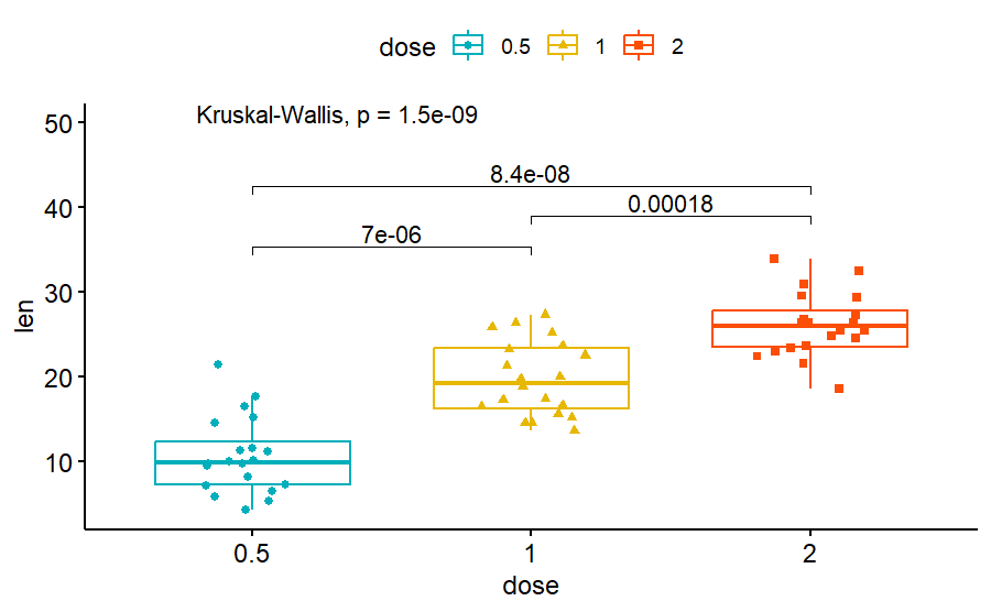
p1 <- ggboxplot(ToothGrowth, x = "dose", y = "len",
color = "dose", palette =c("#00AFBB", "#E7B800", "#FC4E07"),
add = "jitter", shape = "dose")
my_comparisons <- list( c("0.5", "1"), c("1", "2"), c("0.5", "2") )
p1 + stat_compare_means(comparisons = my_comparisons)+
stat_compare_means(label.y = 50)
data("mtcars")
ggscatter(mtcars, x = "wt", y = "mpg",
   add = "reg.line",  #
   add.params = list(color = "blue", fill = "lightgray"),
   conf.int = TRUE)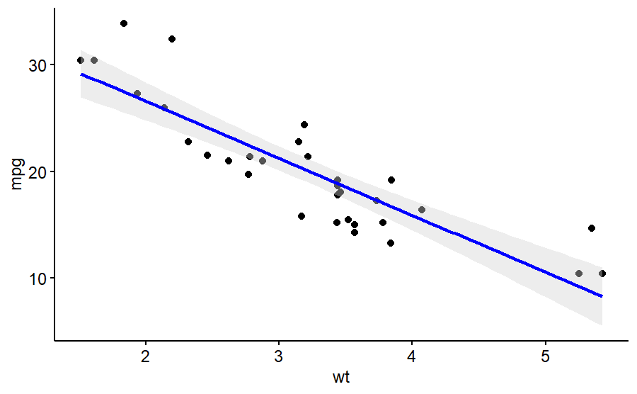
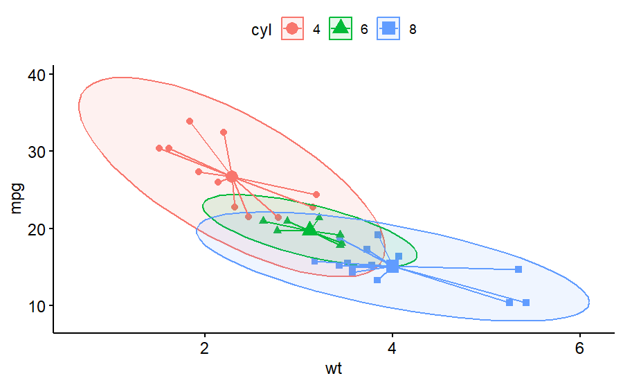
mtcars$cyl <- as.factor(mtcars$cyl)
ggscatter(mtcars, x = "wt", y = "mpg",
   color = "cyl", shape = "cyl",
   mean.point = TRUE, ellipse = TRUE)+
   stat_stars(aes(color = cyl))
- 출처1 : https://partrita.github.io/posts/ggpubr/
- 출처2 : http://www.sthda.com/english/articles/24-ggpubr-publication-ready-plots/81-ggplot2-easy-way-to-mix-multiple-graphs-on-the-same-page/
- 출처3 : http://www.sthda.com/english/articles/24-ggpubr-publication-ready-plots/76-add-p-values-and-significance-levels-to-ggplots/
- rstatix (https://www.datanovia.com/en/blog/how-to-add-p-values-onto-a-grouped-ggplot-using-the-ggpubr-r-package/)
⬛ 2. ggrepel
- ggplot에서 text가 겹치지 않게 위치를 바꾸어 줌
- set.seed()를 설정해서 위치 고정 가능
install.packages("ggrepel")
library(ggrepel)

set.seed(42)

dat <- subset(mtcars, wt > 2.75 & wt < 3.45)
dat$car <- rownames(dat)

p <- ggplot(dat, aes(wt, mpg, label = car)) +
  geom_point(color = "red")

p1 <- p + geom_text() + labs(title = "geom_text()")
p2 <- p + geom_text_repel() + labs(title = "geom_text_repel()")

gridExtra::grid.arrange(p1, p2, ncol = 2)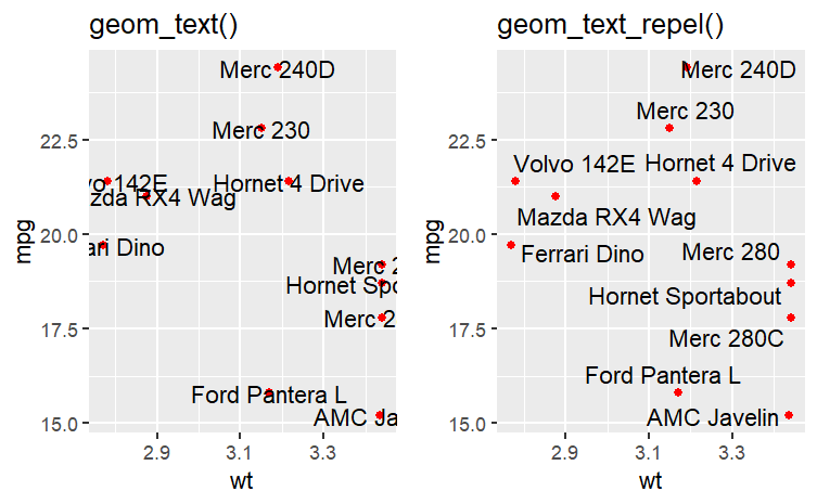
- ggrepel의 경우 박스를 벗어난 글자도 잘 보이게 해주고, 겹친 글씨를 띄어내 준다
⬛ 3. RColorBrewer
- R 색 파레트 중 가장 색의 구분이 확실하고 깔끔한 색으로만 구성되어있는 파레트 이다
- 색은 8개에서 12개 정도로 나누어진다
install.packages("RColorBrewer")
library(RColorBrewer)

display.brewer.all()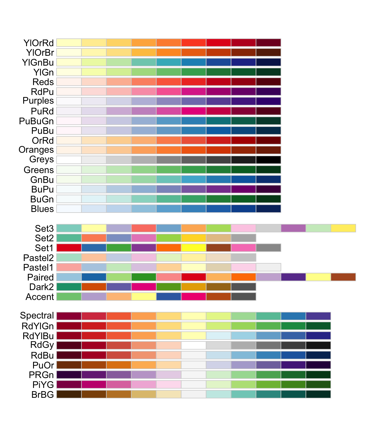
brewer.pal(6, "Paired")
# [1] "#A6CEE3" "#1F78B4" "#B2DF8A" "#33A02C" "#FB9A99" "#E31A1C"

brewer.pal(2, "Paired")
# 경고: minimal value for n is 3, returning requested palette with 3 different levels
# [1] "#A6CEE3" "#1F78B4" "#B2DF8A"
brewer.pal(n, "Palette_type")에서 원하는 파레트에서 n개의 색을 추출할 수 있다
그러나 2개 이하는 기본적으로 경고 메세지가 출력되면서 최소 3개의 색을 추출하라고 한다
이를 이용하여 그래프를 그려보자
df <- iris[1:18, ]
df$name <- 1:nrow(df)

library(ggplot2)
ggplot(df) +
  geom_col(aes(name, Sepal.Length, fill = factor(Sepal.Length))) +
  scale_fill_brewer(palette="Set2") +
  theme_minimal() +
  theme(legend.position = "top")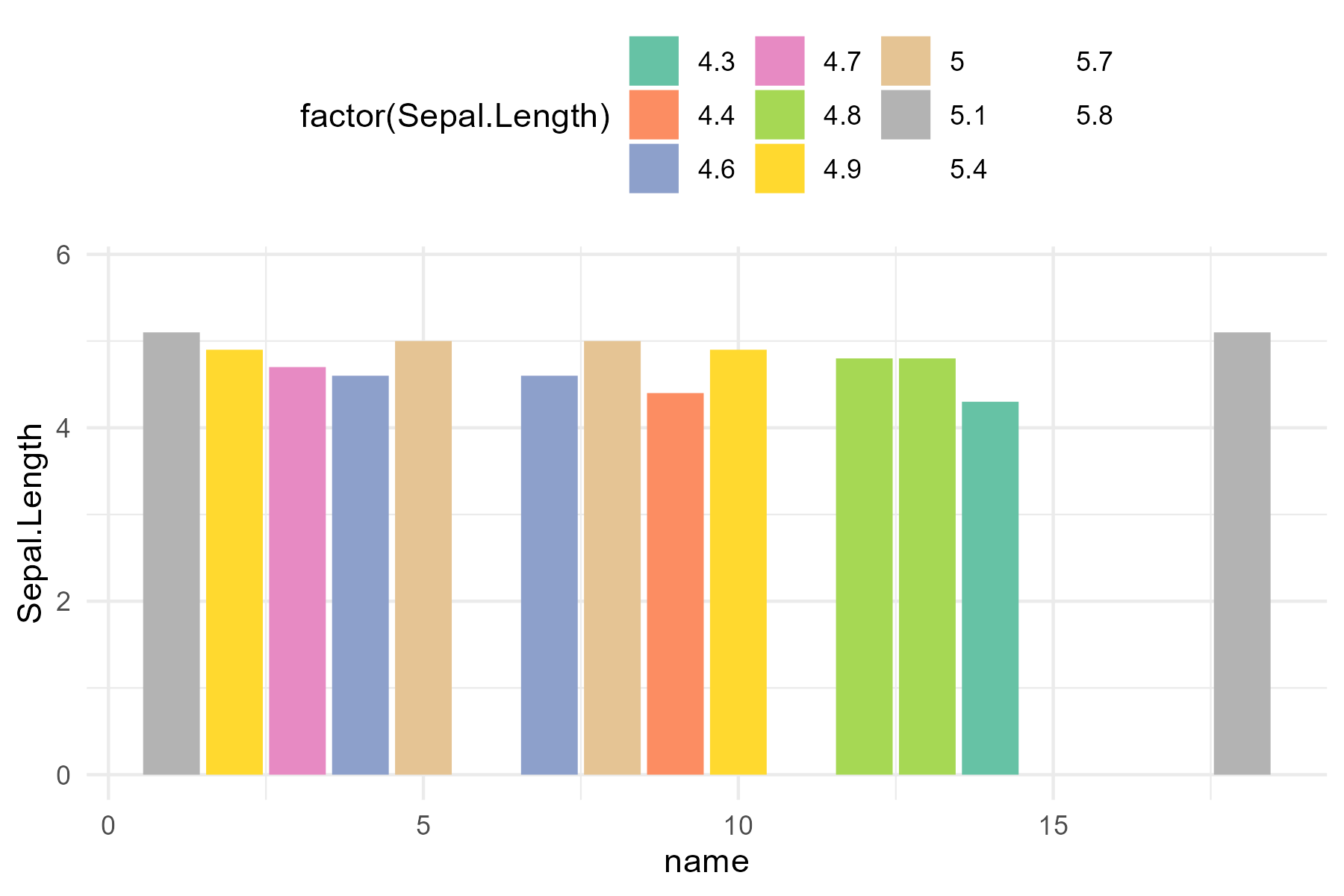
- 출처 : https://r-graph-gallery.com/38-rcolorbrewers-palettes.html
- 출처2 : https://www.datanovia.com/en/blog/easy-way-to-expand-color-palettes-in-r/
⬛ 4. gghighlight
- ggplot에서 색으로 강조하고 싶을때 사용한다
install.packages("gghighlight")
library(gghighlight)


p <- ggplot(iris, aes(Sepal.Length, fill = Species)) +
  geom_histogram() +
  gghighlight()
p + facet_wrap(~ Species)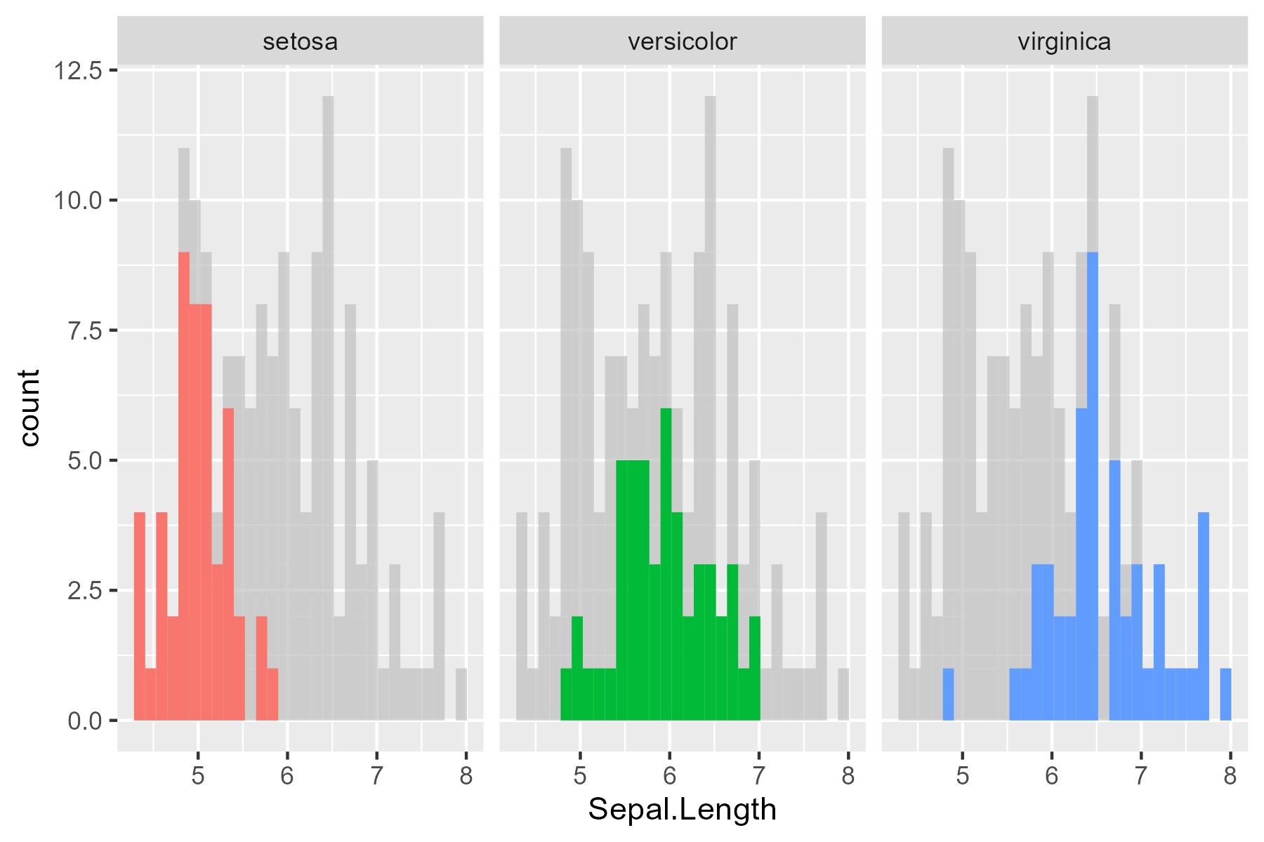
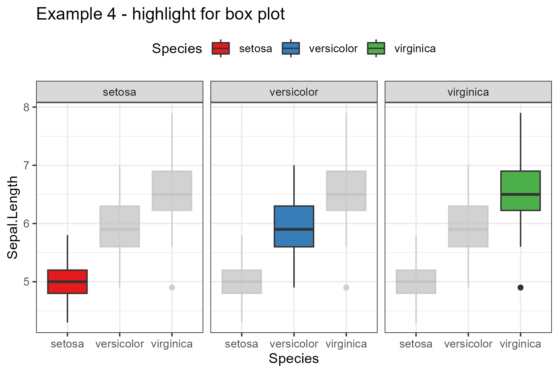
library(dplyr)
library(ggplot2)
library(gghighlight)

my_theme <- function(){
  list(
      theme_bw(),
      scale_fill_brewer(palette = "Set1"),
      scale_color_brewer(palette = "Set1")
    )
}

iris %>%
  ggplot(aes(Species, Sepal.Length)) +
  geom_boxplot(aes(fill = Species)) +
  my_theme() +
  facet_wrap(~Species) +
  gghighlight() +
  theme(legend.position = "top") +
  labs(title = "Example 4 - highlight for box plot")
-
출처 : https://anhhoangduc.com/post/review-gghighlight/
⬛ 5. patchwork
- 이미지 구조 배열을 위한 함수이다.
- ggpurb의 ggarrange를 사용하기도 한다
install.packages("patchwork")
library(patchwork)
p1 <- ggplot(mtcars) + geom_point(aes(mpg, disp))
p2 <- ggplot(mtcars) + geom_boxplot(aes(gear, disp, group = gear))
p3 <- ggplot(mtcars) + geom_smooth(aes(disp, qsec))
p4 <- ggplot(mtcars) + geom_bar(aes(carb))
p1 + p2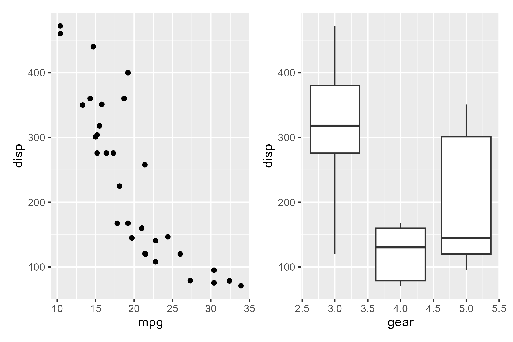
(p1 | p2 | p3) /
      p4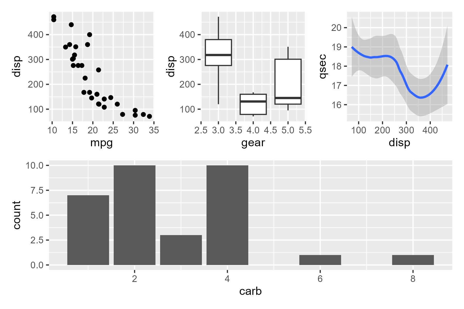
p1 + gridExtra::tableGrob(mtcars[1:10, c('mpg', 'disp')])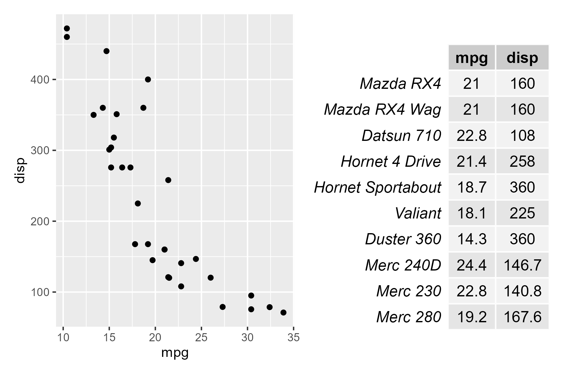
이렇게 표와 같이 나타낼 수도 있다
추가적인 패키지는 아래 링크에서 확인 가능하다
너무 많아서 모든 패키지를 아는 것은 어렵지만 심심할때 찾아서 써보기 좋다
- https://github.com/erikgahner/awesome-ggplot2