[officer] 02. ggplot으로 ppt에서 수정 가능한 figure를 만들어 보자
최근 일러스트레이터 대신 완전히 ppt로만 figure를 만들고 있습니다. 이는 officer과 rvg패키지 덕분입니다.
[R] Venn diagram을 그리는 패키지 5개 비교 에서도 언급한 바와 같이, ggplot의 모든 그림을 officer을 이용해서 편집 가능한 개체로 저장이 가능합니다.
그렇다면, 간단하게 figure를 만들어 보겠습니다.
1. 이전 편
[officer] 01. R을 사용해 저장된 이미지로 ppt만들기 (업무 자동화)
R의 가장 큰 장점은 간편하게 활용할 수 있는 다양한 패캐지이다. 그러나 이제는 CRAN에 등록된 패키지 수가 2만여 개 정도에 달한다. 우리는 그중에서 어떤 것이 나에게 쓸모 있는지 가려내야 한
bio-kcs.tistory.com
2. 필요한 패키지
library(ggplot2)
library(vegan)     # beta diversity계산
library(phyloseq)  # microbiome data
library(patchwork) # 그림 합치기
library(rvg)       # vector로 변경
library(officer)   # pptx로 저장
3. Figure 만들기
저는 마이크로바이옴 데이터를 사용하겠습니다. 그림으로 저장하는 방법만 알고 싶다면, 4. pptx로 저장하기를 참고해 주세요.
data(enterotype)
ps <- subset_samples(enterotype, Enterotype %in% c(1,2,3) &
                     ClinicalStatus%in% c("elderly" , "obese", "healthy"))
meta <- sample_data(ps)
meta
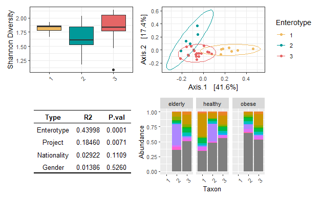
위 데이터는 장내 미생물을 3개의 enterotype으로 나눈 데이터입니다. 이때 샘플링 대상자는 노인, 비만, 정상인 군으로 나누어집니다. 이때 우리는 질병 상태가 아닌 enterotype에 집중하여 figure를 만들어 봅시다.

먼저 alpha diversity를 계산합니다. 예제 figure이니, shannon지수만 사용하겠습니다.
# alpha diversity 계산
alpha_div <- estimate_richness(ps, measures = "Shannon")
alpha_div.table <- merge(meta, alpha_div, by = "row.names")

# alpha diversity 시각화
alpha_plot <- ggplot(alpha_div.table, aes(x = Enterotype, y = Shannon)) +
  geom_boxplot( fill = c("#efba61", "#009999", "#E56666")) +
  labs(x = "Sample", y = "Shannon Diversity") +
  theme_bw()+
  theme(axis.text.x.bottom = element_text(angle = 45, hjust = 1),
        axis.title.x = element_blank())

alpha_plot

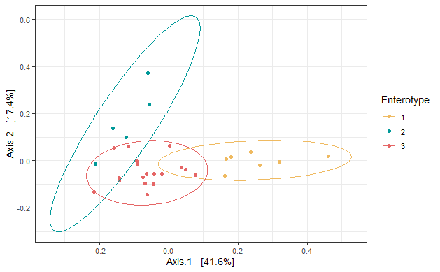
beta diversity에서는 bray-curtis를 사용하여 PCoA plot을 구성해 보겠습니다.
# beta diversity 계산
beta_div <- ordinate(ps, method = "PCoA", distance = "bray")

# beta diversity 시각화
beta_plot <- plot_ordination(ps, beta_div, type = "Enterotype", color = "Enterotype") +
  theme(axis.text.x = element_blank(), axis.title.x = element_blank())+
  scale_color_manual(values =  c("#efba61", "#009999", "#E56666"))+
  theme_bw()+
  stat_ellipse()

beta_plot
추가로, 어떤 데이터가 미생물 군집에 영향을 미치는지 permanova를 사용해 다변량 분석을 수행해 보겠습니다.
dist <- phyloseq::distance(ps, method = "bray")

# PERMANOVA
set.seed(42)
Perma <- adonis2(dist~ Enterotype + Project  + Nationality + Gender, data=data.frame(meta), permutations=9999, method="bray")
Perma
# Permutation test for adonis under reduced model
# Terms added sequentially (first to last)
# Permutation: free
# Number of permutations: 9999
#
# adonis2(formula = dist ~ Enterotype + Project + Nationality + Gender, data = data.frame(meta), permutations = 9999, method = "bray")
#             Df SumOfSqs      R2       F Pr(>F)
# Enterotype   2  0.84069 0.43998 13.2389 0.0001 ***
# Project      5  0.35271 0.18460  2.2218 0.0071 **
# Nationality  1  0.05584 0.02922  1.7586 0.1109
# Gender       1  0.02648 0.01386  0.8341 0.5260
# Residual    20  0.63501 0.33234
# Total       29  1.91074 1.00000
# ---
# Signif. codes:  0 ‘***’ 0.001 ‘**’ 0.01 ‘*’ 0.05 ‘.’ 0.1 ‘ ’ 1

br.perma.R2 <- data.frame(
  Type = c("Enterotype", "Project", "Nationality", "Gender"),
  R2 = c(0.43998, 0.18460,  0.02922, 0.01386),
  P.val = c(0.0001 , 0.0071 , 0.1109, 0.5260)
)


# make table
tbl <- ggtexttable(br.perma.R2, rows = NULL, theme = ttheme("blank")) %>%
  tab_add_hline(at.row = 1:2, row.side = "top", linewidth = 2) %>%
  tab_add_hline(at.row = 5, row.side = "bottom", linewidth = 3, linetype = 1)
tbl
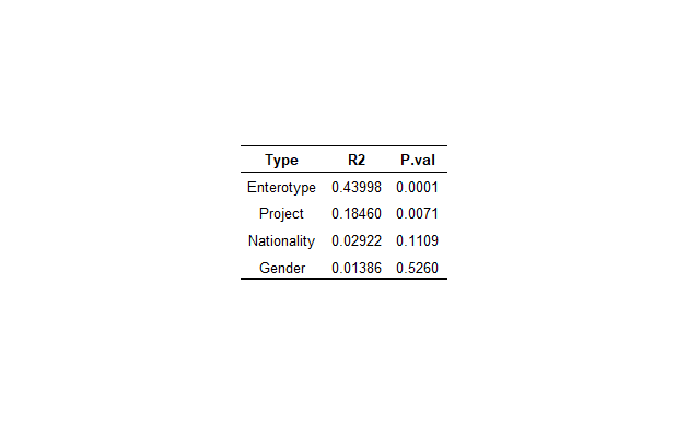
결과적으로는 Enterotype이 미생물 variance의 43%를 설명한다는 결과를 얻었습니다.
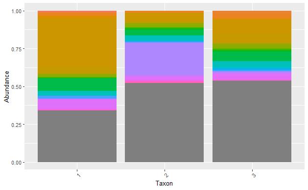
위 데이터는 Genus-level데이터만 가지고 있습니다.
melt.tab<- psmelt(ps)
tax <- tax_table(ps) %>% data.frame()


# pptx에서 편집 시 과부화를 줄이기 위해 각 group별로 합하기
melt.tab2 <- melt.tab[, c(3,4, 12, 13)]  %>%
  dplyr::group_by(Genus, Enterotype, ClinicalStatus) %>%
  dplyr::summarise(across(.cols = Abundance, .f = sum))

# taxa plot그리기
tax_plot <- ggplot(melt.tab2, aes(x = Enterotype, y = Abundance, fill = Genus)) +
  geom_bar(stat = "identity",position = "fill" ) +
  labs(x = "Taxon", y = "Abundance") +
  theme(axis.text.x = element_text(angle = 45, hjust = 1),
        legend.position = 'none')

tax_plot
4. pptx로 저장하기
얻어진 4개의 figure를 patchwork를 사용해 하나의 figure로 묶어봅시다. patchwork의 장점은, 각 그림 간의 비율이 자동적으로 맞추어진다는 점입니다. 자세한 방법은 patchwork tutorial을 참고해 주세요.
figure <- (alpha_plot|beta_plot)/(tbl | tax_plot)
figure
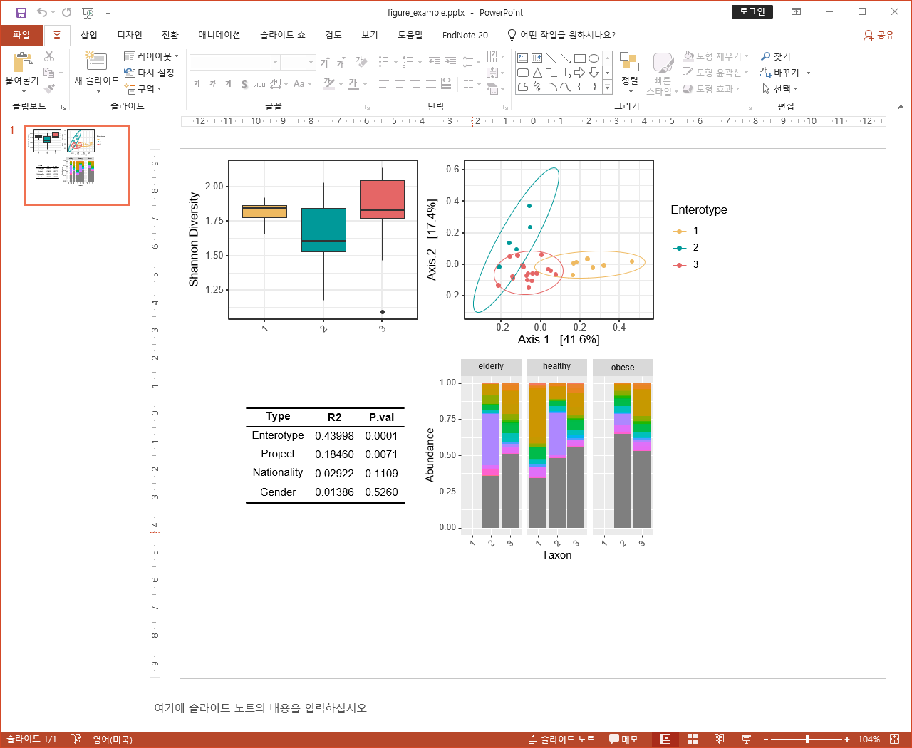
figure로 저장된 위 그림을 rvg패키지를 이용하여 편집 가능한 이미지로 바꾸어 줍시다.
# 편집 가능한 이미지로 변환
editable_graph <- rvg::dml(ggobj = figure )

# 빈 pptx만들기
read_pptx() %>%
  print(target = "../output/figures/figure_example.pptx")

# pptx의 테마와 슬라이드 확인하기 -> 한글인지 영어인지 확인
read_pptx( "../output/figures/figure_example.pptx")

# ppt안에 저장하기
read_pptx( "../output/figures/figure_example.pptx") %>%
  add_slide("Title and Content","Office Theme") %>%  # 위에서 확인한 내용이 한국어라면, 이에 맞게 변형
  ph_with(editable_graph, location = ph_location(left=0, top=0, # 저장될 위치
                                                 width = 8, height = 6, bg="transparent")) %>% # 그림 크기
  print(target = "../output/figures/figure_example.pptx")
짜잔! 결과적으로 모든 figure가 비율에 맞게 배치되었으며, 편집 가능한 그림을 얻을 수 있었습니다.
유의할 점은 그림이 너무 복잡하거나 이미지가 크면, pptx에서 수정이 불가능할 정도의 랙이 걸립니다.
특히 taxonomy composition을 편집하려면, 꼭 dplyr을 사용해서 필요한 개체별로 abundance 합친 다음 그리는 것을 추천드립니다(중요!).
참고
https://ardata-fr.github.io/officeverse/officer-for-powerpoint.html
https://optimumsportsperformance.com/blog/displaying-tables-plots-together/